The Campbell
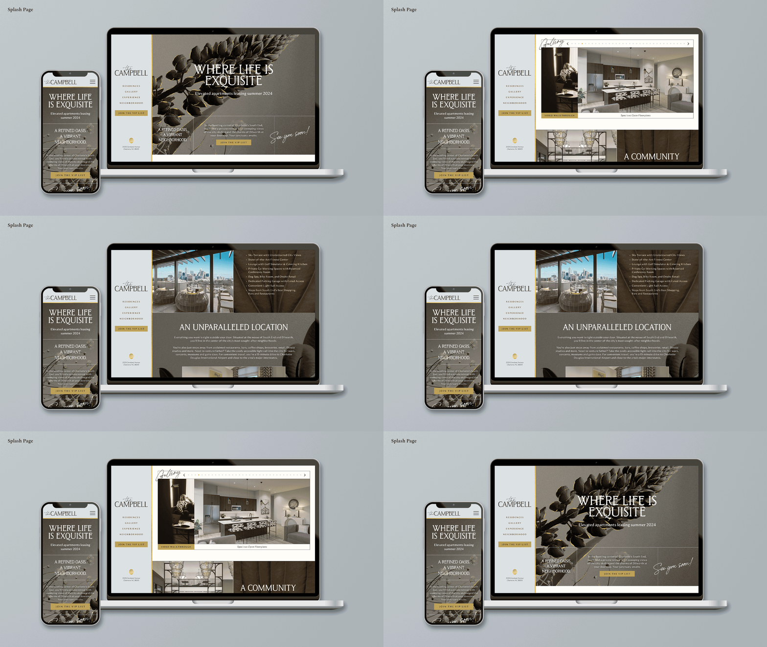
The client approved and used the logo, fence wraps, and splash page. All other assets that we designed were created as spec for brand concept approval.
The Campbell is a boutique, multi-family building that is aiming to offer a truly elevated living experience compared to other ‘luxury’ complexes in the South End, Charlotte area. They came to Mythic looking for a brand identity that reflects this finer standard of living, while nodding to the history of the building site — a beloved community plant nursery.
After participating in a client strategy session, it felt right to lean into ‘quiet luxury,’ with neutral and refined designs. I expressed this visually with subtle serifs and ‘signature’ scripts, artistic floral and foliage photography, gold accents, and an icon reminiscent of a country club.

The script of the logo provides a ‘signature’ touch that will be used throughout the brand while the high x-heights of the serif reflects the art-deco inspired interiors. The icon uses interlocking C’s representing an abstract flower to create a stamp-like icon to be used on uniforms, swag, and throughout the building.
The color palette was inspired by natural elements — metals, plants, and stones — to provide a soft, relaxing palette with punches of warm colors throughout. The palette was carefully tuned in order to adhere to WCAG 2.1 compliance and allow for multiple color combinations.


The photo direction was put together to evoke a sense of authenticity across the brand. Consistency across photo styling and editing techniques are especially important for a brand like The Campbell, who is trying to attract a higher-end customer. Not only will this cohesion throughout the brand, but increase trust and recognition with current and potential tenants as well.
All of this is pulled together with grid structures and gold foil accents to create structure and emphasis to an otherwise ‘quite’ brand. See the result below:


